Why maps matter: the hidden power relations in world maps
Over centuries maps have been and continue to be an important representation of our understanding of the world. Maps show direction, make the world surrounding us comprehensible and bring order into the unimaginable vastness of earth. However, a depiction of our world might not always be as innocent as we think at first glance. Maps also have the capacity to trick us, to change our thinking and influence our behaviour. And they have a hidden power of perpetuating power relations in our world.
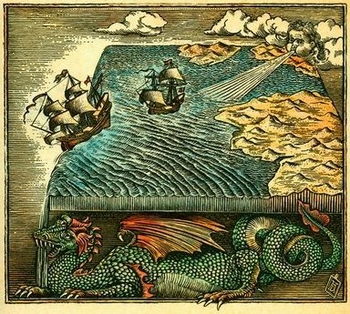
If that sounds too farfetched and like some kind of witchcraft, just think of medieval maps that depicted the world as being flat. Nobody, except for a few brave sailors, dared to move beyond the perceived horizon in fear of simply falling off the edge of the world into an endless nothingness. Maps function within the prevalent knowledge of their time. As the limited knowledge of ancient times regarding geography and physics was depicted threateningly in maps, it stopped people of former centuries from pushing beyond the territory that was known to them.
The way our scientific knowledge about the world increased, the more sophisticated became our maps. Now this could lead to the misperception that maps have lost their power as there is no place on earth that has not been discovered, not one street that Google Maps has not categorized and we all have seen exact depictions of our world due to maps that exactly show us how the world is shaped, right? Or is there maybe something more to it?
Even nowadays the way we depict the world and present it, influences our thinking and behaviour. The world map that everyone is familiar with looks like this:
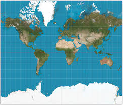
This is the so-called Mercator projection, a map which was created in 1596 to help sailors navigate the world and is nowadays still found in most classrooms. Although being scientifically accurate, the biggest problem with the Mercator projection is that it distorts the size of countries in favour of wealthier countries in the North. Greenland and North America appear disproportionately large whereas Africa and India seem shrunken – although in reality you could fit North America into Africa and still have space for India, Argentina, Tunisia and some leftover. This leads to us thinking that countries in the Southern part of the globe are less important, weaker and less impressive than the ones in the Western hemisphere – which often overlaps with our prejudices regarding the wealth and development of Southern countries. Also, Antarctica seems to be vastly bigger than it actually is which in turn seems to suggest to us that it will take ages for it to vanish due to climate change. If the area of ice and snow were to be depicted differently, maybe we would be more aware of its smallness and need for protection.
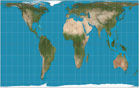
Maps can still influence us enormously and together with common conceptions of our times about the distribution of wealth, development and importance, they still play a role in our thinking. Therefore, some attempts have been made in showing a more realistic version of our world in maps.Yet, it is simply impossible to completely and realistically project the round world on a flat map. Nonetheless, D. Arno Peters came up with the Gall-Peters projection which you can see here. Although it is more truthful to the actual size of the countries, it is stretching the continents horizontally and vertically:
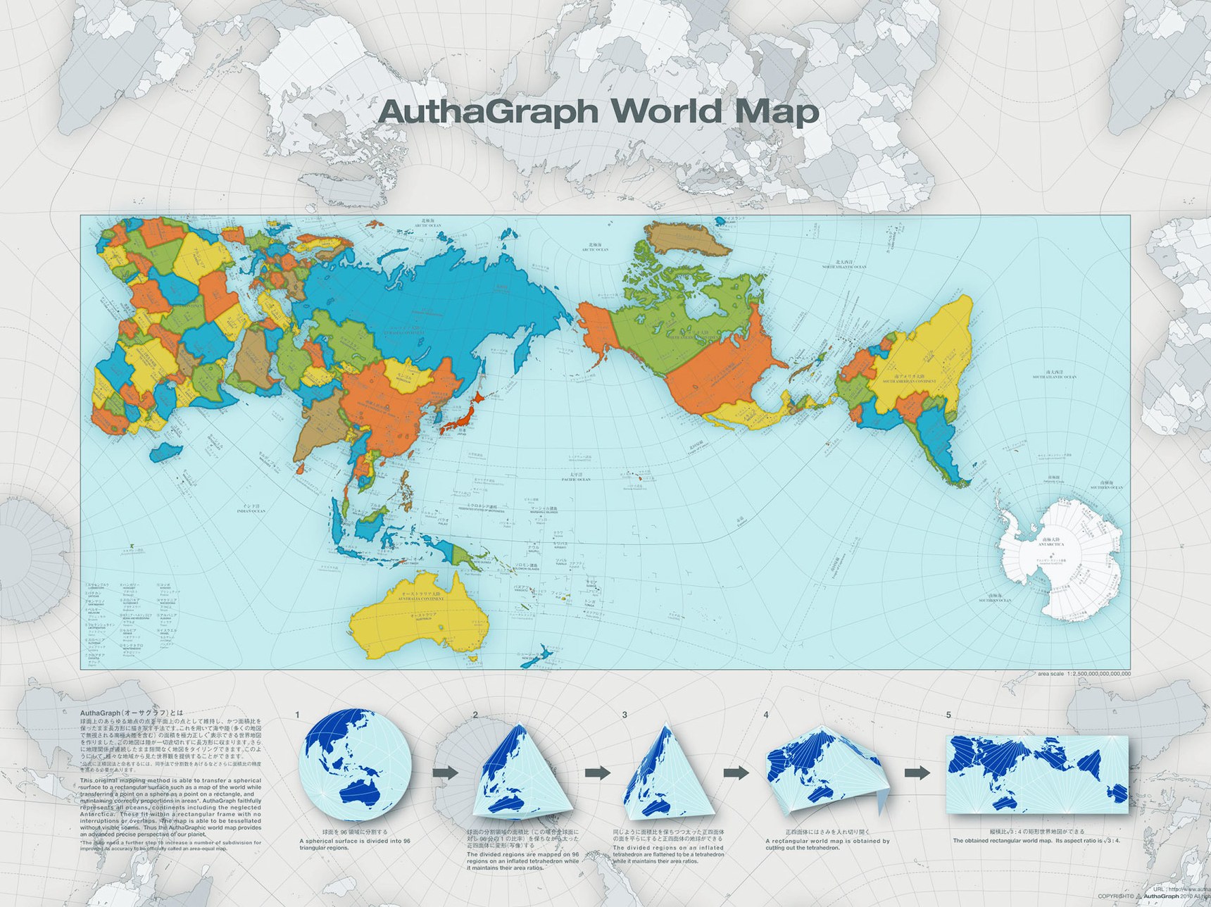
Another approach to depict the world more accurately is a map called “AuthaGraph” that has been created by Hajime Narukawa at Keio University’s Graduate School of Media and Governance in Tokyo. In this approach, the AuthaGraph map faithfully represents all oceans and continents, including the neglected Antarctica which gives an advanced precise perspective of our planet. The trick is that our world is divided into 96 regions, then folded in a tetrahedron and then a pyramid before returning to its two-dimensional version.
Such a map and its more truthful representation of the world might be more suitable to our current challenges of the 21st century.
In the end it is important to remember that the way our world is depicted and the way we perceive our world to be translated into how we behave and how we regard (or more often disregard) areas that seem to be small and neglectable on a world-scale. The power politics of maps should not be underestimated and approached in full conscience that the real world is more complex and difficult to capture than what a single map might suggest.


